Revisit: Analyzing the Stock Market with Transfer Entropy Graphs
A revisit of: https://www.imjustageek.com/blog/using-causation-networks-to-predict-future-network-robustness
Introduction
Recently, I have been reconsidering my approach to a previous project that uses graphs to help analyze volatility in dynamic systems, more specifically, the stock market. The issue that kept popping into my mind was that it was easy to explain the ideas behind the graph and its construction; however, when I tried to explain how to extract the predictions from this graph it became very convoluted, to the point that even I felt manic trying to describe it. So I went back to the drawing board and developed a more systematic approach to analyze these graphs and explore a new way to find the potential predictive power of the graph's structure.
Transfer Entropy Graph and Data Collection
To recap some, the graph that we are trying to analyze is called a transfer entropy graph. You can look at the beginning of the last article (https://www.imjustageek.com/blog/using-causation-networks-to-predict-future-network-robustness) to get the details of how exactly it's constructed, but here is the gist of it. Between two time series of values you can calculate transfer entropy. It's a unitless measure that describes how changes in a source time series can correlate with future changes in a target time series.
So, for example, let's take the daily stock price of Apple and the daily stock price of Microsoft for the past year. We can calculate the transfer entropy from Apple to Microsoft. If it's a large number, that means the price of Apple historically had some correlation to the future price of Microsoft. The interesting thing is that typically similar companies like these will have a small transfer entropy, as they usually move together rather than directly lead to changes from one to another. So just because two companies would have a high correlation does not mean that they would have high transfer entropy.
To construct the graph, we would first make a node for every one of the companies we have data for. We then calculate the transfer entropy for all combinations of companies over a specific period. The graph will then be filled with directed edges with the calculated transfer entropies. Let's say we have a transfer entropy of 1.1 from Microsoft to Apple. We would add an edge that points from the Microsoft node to the Apple node with a value of 1.1. Then we will continue to add edges for every combination of companies in our dataset.
An example of a graph is below.
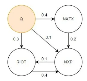
A Small Transfer Entropy Graph
Overall, a single transfer entropy graph would be a snapshot of the market at a specific date using a specified window of data before that date.
For this iteration of the project, we will create many transfer entropy graphs for random dates over the past five to ten years to help develop a large dataset for creating a useful model. This is one area in which the last project fell short, as previously we only analyzed a single transfer entropy graph when trying to make a model, and attempted to find the significance of that model versus making predictions with a "random graph". Using many transfer entropy graphs over an extended period will give us a better sense of how well this method of constructing graphs is for predicting market volatility.
Note: For this iteration we still use Effective Transfer Entropy, Use Significance Tests, and use the Total Market Movement as a background process. All non-significant and/or 0 transfer entropy connections are not included in the graph.
Data Collection
To construct the graphs, we first collect the daily stock prices of the top 3000 companies by current market cap from 2010 to the beginning of 2025. This is the pricing data to serve as the base for all graphs. We filter out companies that IPO'd in 2024 and any companies that would have missing data during this time. (This leaves us with about 2500 companies) This time, we focus on average weekly prices of the stock to filter out any day-to-day trading noise and focus on more mid-frequency price movement.
Next, we reduce the dataset by transforming it to be the five-day averages of the stock price, and then convert the data to be absolute percent changes of the five-day average prices. Using percent change normalizes the data, as the transfer entropy calculation can be sensitive to magnitude, and the magnitude of the price of a company provides limited useful information. Next, we select 500 random days from 2010 to 2025 and construct a transfer entropy graph for each date using the previous year's data. This will leave us with 500 graphs, which we can use to help create our model.
So, for example, let's take three dates: May 2nd, 2019, March 27th, 2023, and June 8th, 2021. The three graphs created would be using the time series data from May 2nd, 2018-19, March 27th, 2022-23, and June 8th, 2020-21. Each graph would have 2500 nodes, one for each company, and the transfer entropy values connecting them would be calculated from that year of time series data. These three graphs will then be used to analyze volatility from May 3rd, 2019, March 28th, 2023, and June 9th, 2021, onward.
The New Analytical Approach
At this point, the two projects follow roughly the same methodology, but now we start diverging. Previously, we attempted to create a Random Walk Algorithm that takes in a significant event (stock price change) to output a table of companies most likely to be affected by that event. This was repeated for all events that day (or that week, etc), the tables were combined, and this led to the creation of a master table that identifies the companies most affected by the price movements on any given period for a specific transfer entropy graph. The master table did work pretty well, but there was a significant amount of calibration and parameter optimization that went into how the Random Walk Algorithm worked, what was deemed a significant price event, which connections in the transfer entropy graph were included, how the resulting tables were merged, and what was considered a significant value in the master table. The parameters could be calibrated for each instance of the transfer entropy graph, but this leads to numerous opportunities for bias in the model. In addition, it makes it challenging to create a new model for new graphs, as it has to recalibrate all over again. (Also, overall, it made it difficult to use traditional model performance metrics.)
Instead, what will be done for this iteration is to use the transfer entropy graph to help produce discrete features that can be put in a tabular format, and then use more traditional machine learning training algorithms to create applicable models that predict future price volatility (our target feature). In addition, this would open up the possibility of more conventional measures of model performance beyond simply proving that values created by a Random Walk Algorithm would be significant.
One key performance measurement I want to bring up is the ability to construct a better model than one that only considers current price movement, as it is not hard to make an effective model that looks at recent price volatility to see if it will move more in the future. (If it's moving more now, of course, it will move more in the future.) The difficult model to create is one that beats that baseline, and finding features that provide the model more significant information than just current price movement. That is what this new methodology aims to demonstrate: that adding graph-based features can create a more substantial model than just looking at the recent volatility of the market.
Feature Creation
The following features will be generated for each selected random date from its associated transfer entropy graph, and this group of features will be found for all companies that we would be interested in analyzing. We will then combine the features across all random dates to create a master dataset.
So, for example, if we want to investigate the energy industry (which we will do), we will take a representative set of 30 companies and find the following features for each company on a specific date to be put in the table. This will be repeated for multiple random dates over the past five to ten years to create a master dataset. In this example of 30 companies, 500 random dates would create a table with 15,000 entries of data using 500 generated transfer entropy graphs. Each entry in the table would have all 25 features described below.
Target Feature
Target 5: Percent Change of the Company 5 Days into the Future
Base Features
Base 10: Percent Change of the Company over the past 10 days.
Base 5: Percent Change of the Company over the past 5 days.
Base 1: Percent Change of the Company over the past day.
Base 5 Avg.: The average Base 5 of all companies in the graph.
Base 5 Std. Dev. : The standard deviation of the base 5 of all companies in the graph.
These are the base features that we will improve upon. These five base features can already tell us a significant amount about our target feature, which we are trying to predict. If adding new features makes the model perform the same or worse, we haven't found any significant information to add to the model. Our goal is to create a model that will perform better using all features versus just the five base features. Typically a poorly performing model with more garbage features will have a very high training score, but a very poor test score as the additional features mislead the model from the base significant features.
Graph Characteristics Around a Node (Company)
In Degree: Number of Connections into a Node
Out Degree: Number of Connections out of a Node
Total Degree: Total Number of Connections
Betweenness: A high betweenness node acts as a bridge between otherwise separate parts of the network. It controls the flow of information from some parts of the graph to other parts.
Closeness: Measures how close that node is, on average, to all other nodes in the graph.
Page Rank: Measures a node's importance based on the idea that being linked to by essential nodes makes it more important.
Clustering: A high clustering coefficient means the node's neighbors are also connected, indicating a tight-knit local community.
These are all structural characteristics of a company inside the graph. Understanding how connected a company is to other companies in the graph could reveal information about how much it responds to local and market-wide volatility. A simple example hypothesis is that the more connected it is, the more it will react to other movements in the stock market, or the less connected it is, the less its movements will affect different companies near it. To note, these characteristics do not take into account any price change that has occurred in this period, and is only looking at the graph structure.
Note: To gather these features, we filter out the bottom 5 percent of non-zero transfer entropy connections in the graph. (Helps reduce computation time, and focus on more significant connections.)
Volatility Characteristics
Count 1 Hop: Number of companies 1 Hop from Target Company (Same as Total Degree)
Average 1 Hop 1/5/10: Average Percent Price Change (over 1/5/10 Days) of companies one hop from the target company.
Min 1 Hop 1/5/10: Minimum Percent Price Change (over 1/5/10 Days) of companies one hop from the target company.
Max 1 Hop 1/5/10: Maximum Percent Price Change (over 1/5/10 Days) of companies one hop from the target company.
Std. Dev. 1 Hop 1/5/10: Standard Deviation of the Percent Price Changes (over 1/5/10 Days) of companies one hop from the target company.
Median 1 Hop 1/5/10: Median Percent Price Change (over 1/5/10 Days) of companies one hop from the target company.
Count 2 Hop: Number of companies two hops from the Target Company.
Average 2 Hop 1/5/10: Average Percent Price Change (over 1/5/10 Days) of companies two hops from the target company.
Min 2 Hop 1/5/10: Minimum Percent Price Change (over 1/5/10 Days) of companies two hops from the target company.
Max 2 Hop 1/5/10: Maximum Percent Price Change (over 1/5/10 Days) of companies two hops from the target company.
Std. Dev. 2 Hop 1/5/10: Standard Deviation of the Percent Price Changes (over 1/5/10 Days) of companies two hops from the target company.
Median 2 Hop 1/5/10: Median Percent Change (over 1/5/10 Days) of companies two hops from the target company.
These features combine both structural information of the graph, and also the recent dynamic details of price changes in that period.
Note: To gather one-hop features, we filter out the bottom 5 percent of non-zero connections (which helps reduce computation time). For two hops, we filter out the bottom 75 percent of the connections (which helps create a variety of feature magnitudes, as typically all companies' two-hop features converge if too many connections were included).
Note: Percent change values were multiplied by the transfer entropy value of the edge, giving more weight to connections with higher transfer entropy.
Dataset Construction
Two main datasets were constructed. One focused on the Energy Sector, and one focused on the Tech Sector. For each, we gathered a list of about 25 to 30 companies to collect features for. Next, we used about 200 to 300 transfer entropy graphs (random dates) from the past 8 years to analyze out of the 500 generated.
Using information that was too old made performance degrade pretty quickly. Using three to eight years had roughly the same results, with eight having the most data points for significance. This does introduce some recency and selection bias, but having this large of a window (on the order of years) means there is time for the model to respond to new information as it comes in.
For Tech and Energy, two final datasets were constructed:
Base: Contains the base five features with the single target feature.
Full: Contains all features with the single target feature.
Feature Selection
I conducted some analysis where I attempted to do more precise feature selection and modification by normalizing values, reducing multicollinearity, and addressing skew, etc. However, all treatments had minimal impact on the final performance of the model, however some features with very high correlation were removed to make a final set of 24 features. XGBoost Regressor and the XGBoost Classifier model effectively addressed these shortcomings in the data, however pruning they very highly correlated features was a simple improvement that could be done.
Results
Linear Regression Analysis of the Datasets (R2/Adjusted R2)
Now that we have the final datasets, we examine the performance of linear models for each specific day selected, and then we look at how well the models work across all days in a combined dataset. The individual days was an attempt to see how well each graph performed by itself, and the combined results tell us how well the model works overall accross all graphs.
The following two graphs look at: the base dataset, only the structural characteristics, only the volatility characteristics, and then the combined characteristics.
Per Day Energy Sector

Histogram of Per day adjusted R2 fits. Lines are where the median lies.
Per Day Technology Sector
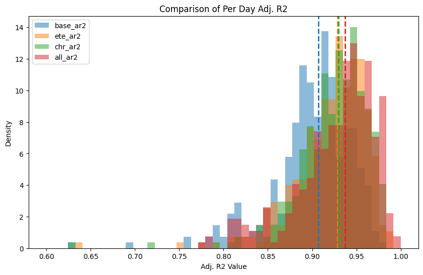
Histogram of Per day adjusted R2 fits. Lines are where the median lies.
Looking at the adjusted R2 for the daily datasets, the added characteristics give a significant increase in explanation of variability in the target feature for each individual days dataset. However more than likely this is majorly contributed from the large amount of additional features (adjusted R2 can’t fully account for additional features), however is a promising start.
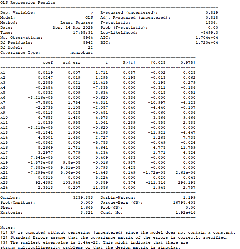
Combined Energy Sector
Base Dataset
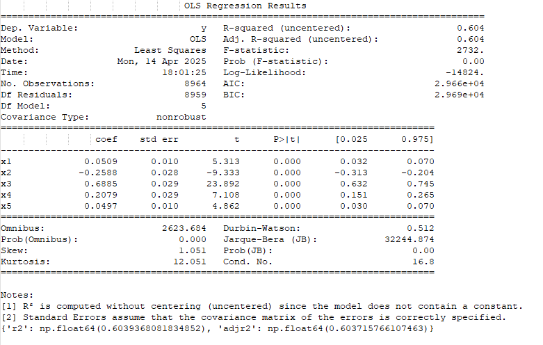
The Linear Regression of the Base Features to the Target Feature
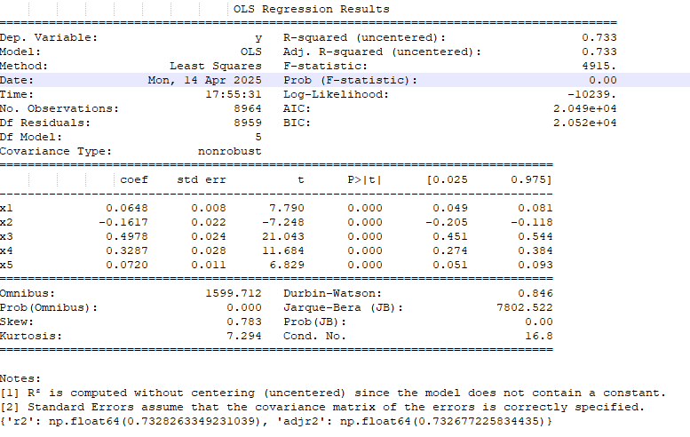
Full Dataset

The Linear Regression of All Features to the Target Feature
Combined Technology Sector
Base Dataset
The Linear Regression of the Base Features to the Target Feature
Full Dataset
The Linear Regression of All Features to the Target Feature
Looking at the combined dataset, we again see that the adjusted R2 (top left in the table) of the overall model goes up in both cases. In addition, a majority of the added parameters have significant p-values themselves (P>|t| column), meaning the parameters add significance to the model.
Overall, the linear regressions look promising that a better model could be made using all features; however, we still need to do more work to see if that's the case.
XGBoost Regressor Models
After using linear regression to determine if the added features have significant explanatory power, the next step was to see if a model could take advantage of these added parameters. In most cases, you can add more features for more explanatory power, but unless a model can take advantage, there isn't much use. Many times adding more non-significant features can just add to overfitting resulting in lackluster test scores.
Here, I used an XGBoost Regressor on the base and full datasets and evaluated their performance. Both the base and full models went through hyperparameter tuning to try to make the most optimal model.
Energy Sector
Full Model
Train MSE: 0.0816, Train R²: 0.9283
Validation MSE: 0.4920, Validation R²: 0.4487
Test MSE: 0.4039, Test R²: 0.6017
Base Model
Train MSE: 0.3502, Train R²: 0.6925
Validation MSE: 0.5221, Validation R²: 0.4150
Test MSE: 0.4239, Test R²: 0.5819

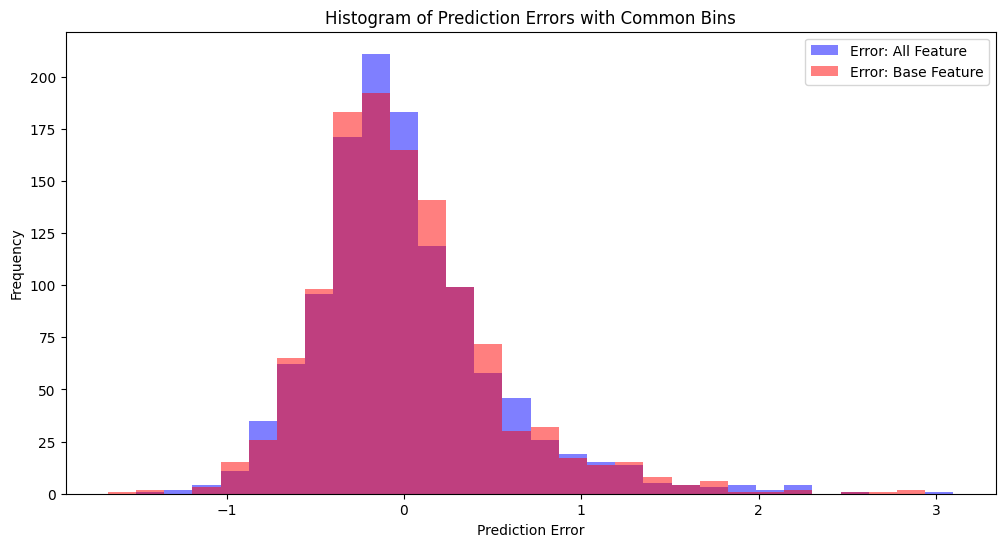
Histogram of Test Sample Errors
Number of test samples where Full Model has lower error: 682
Number of test samples where Base Model has lower error: 514
Tech Sector
Full Model
Train MSE: 0.1043, Train R²: 0.7473
Validation MSE: 0.2486, Validation R²: 0.3667
Test MSE: 0.2639, Test R²: 0.3658
Base Model
Train MSE: 0.1564, Train R²: 0.6209
Validation MSE: 0.2503, Validation R²: 0.3625
Test MSE: 0.2704, Test R²: 0.3502
Histogram of Test Sample Errors
Number of test samples where Full Model has lower error: 617
Number of test samples where Base Model has lower error: 579
Here, the XGBoost Regressor models showed that the added parameters allowed for better model construction over the baseline model in both cases, but only by a smaller amount. When looking at the specific test predictions, we also see that the full model does give a closer prediction more of the time. (It's still possible overall the model performance would get better in terms of MSE/R2; however, in each test instance, it still can get it wrong more times than the base model. So these are also positive results.)
These results are ok, however, we are asking a lot of this model to predict specific values of price changes for companies.
XGBoost Classifier Models
After the performance of the XGBoost Regressor was promising, I thought more about it, and I realized that the regressor model is trying to do more than we need it to. In the end, it would be nice to predict the exact volatility (of course); however, if we zoom out and instead use this data to classify whether the volatility in the future would be high, medium, or low, we may obtain better results (and have more realistic expectations of a model).
Hyperparameter tuning was also done for the full and base models (however, it had less of an effect than the XGBoost Regressor model), and the thresholds for low and high are the 15th percentile and 85th percentile of price movements over the timespan of the collected data.
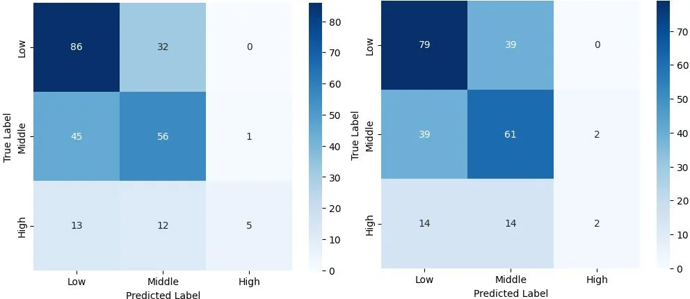
Energy

Left: Full Model, Right: Base Model
Tech
Left: Full Model, Right: Base Model
In both cases, we see that for the "High" volatility classification, the full model becomes significantly more accurate, from 50% to 83% for the tech sector, and 55% to 86% for the energy sector. So by making a more realistic expectation of the model and what it needs to try and predict, we see the added parameters actually can give some pretty significant improvement. There is also a slight improvement in the other two categories, however, not a drastic one.
Conclusion
1) In the end, it does look like these added parameters do have some added predictive power, even though it may be small.
2) It is interesting that the two sectors did have slightly different results, but were in the same ballpark in terms of improvement.
3) This also showed that sometimes to get better performance, it's good to take a step back and make sure you have realistic expectations of what the model can do.
Next, Imma gonna try to set up a GCN Classifier to start using deep learning to analyze the graph. In this case instead of hand constructing the feature set, the GCN will create its own set of significant features.
Thanks for reading. Feel free to reach out if you have any Questions. There are a lot of little steps and gotchas that aren't really in this description (a lot in terms of data collection and handling).