Crypto Market Rewiring After Trump’s China Tariff Announcement: Evidence from Transfer Entropy Networks
Recently, I've been spending some more time on a side project called catchfire.finance. It's designed to help visualize market structure, generating daily transfer entropy graphs that reflect the current state of various markets.
To support deeper analysis, I also built a backfill script that generates these transfer entropy graphs for historical dates. That lets me evaluate how well the graphs can be used for modeling without waiting months for enough forward-looking data to accumulate. While reviewing the crypto market backfills, I noticed something: on a specific date, the network exhibited an abrupt structural shift. The change was so pronounced that my first assumption was a technical issue: maybe the backfill script didn't match my daily automated script, perhaps I had corrupted the data, or the crypto API I was using had changed in the background.
However, when I checked online, the timing lined up with a real-world shock, the day Trump announced significant import tariffs on Chinese goods. I thought that it would make a compelling case study, both as validation of the method's ability to capture regime-level disruptions and as a way to explore the insights these structural breaks can reveal. (Also, maybe provide a case about why my site might be a good place to visit every once in a while)
Introduction and Background
Transfer Entropy Networks
First, some quick background: Transfer entropy (a measure of information flow) provides a framework for quantifying directional relationships between time series data. In cryptocurrency markets, transfer entropy measures how well one cryptocurrency's price movement correlates to another's movement in the past. By constructing networks in which cryptocurrencies serve as nodes and transfer entropy relationships as edges, we can analyze the market's underlying structure of how investment flows through these markets.
In the real world, markets don't evolve smoothly; major events like regulatory announcements, exchange failures, liquidity shocks, or technology upgrades can rapidly rewire who influences whom. In a transfer entropy network, those shifts manifest as measurable changes in structure, as seen in previous research and in my observations later in this article. Edges strengthen or weaken, new influence pathways emerge, and centrality can migrate from one set of assets to another. That gives us a quantitative way to detect and characterize "market shocks," track how influence propagates through the market, and flag when the market has moved into a new regime.
Beyond the characteristics of the structural shift, I also intend to investigate whether models can perform well across these regime changes, or whether new models need to be developed when a regime change is detected. This analysis can also provide insight into how well a model might perform over regime changes that it hasn't been trained on.
Transfer Entropy Network Construction
I quantify transfer entropy (TE) as introduced initially by Schreiber, implemented via the PyInform library's time-series transfer entropy routine. [1,2] The estimator is applied pairwise to the three-day percent return time series of each crypto ticker. The idea of using three days instead of one is to serve as a noise filter, and it also works better just based on observations from previous experiments.
When estimating transfer entropy from empirical financial time series, we encounter two related problems that must be accounted for. First, the data is finite: for any given graph snapshot, each ticker contributes only a single observed time series. This limitation leads to a high noise‑to‑signal ratio and introduces finite‑sample bias into TE estimates. Second, even in the absence of a genuine directional relationship, background market movement and shared noise can produce non‑zero TE values, resulting in spurious information flow. In this context, raw TE may reflect general market co‑movement rather than a meaningful, directed interaction between a specific source and target.
To address these issues, we compute effective transfer entropy (ETE), a bias‑reduced estimator introduced by Marschinski and Kantz. [3] The procedure begins by computing the standard TE between a source and a target time series. The source series is then randomly shuffled while the target is held fixed, and TE is recomputed on this randomized pair. This randomization is repeated 30 times to generate a null distribution of TE values, from which the mean randomized TE is calculated. The effective transfer entropy is obtained by subtracting this mean randomized TE from the original TE. This subtraction removes background contributions attributable to noise and finite‑sample effects, leaving a measure that more reliably captures unique, directed information flow between nodes.
Since we have randomized calculations, we can also calculate a z-score for the TE measurement from the mean and standard deviation of the shuffled set of TEs. We convert the z-score to a one-sided p-value, and we keep connections with p<0.005. (0.5%). This approach, seen in previous papers, emphasizes bias reduction by retaining only significant directed connections in the induced TE network. [4,6] To note, the paper [4] also suggests using a multivariate (rather than bivariate) approach by including a background time series. This has been done for other markets in my project, but not for crypto (at least for now). So this is one improvement that can be made in the future and is worth pointing out.
A TE Network is then calculated every day over the past year for use in this analysis. This network includes all Crypto price indicators accessible through my API, totaling about 700. I say 'price indicators' because some cryptos appear multiple times, as they have exchange rates with currencies other than USD.
Note: If price data was missing, the blank values were filled in with the previous close. If the gaps were too large (3 or greater) or if the crypto was tiny with gaps (<$0.05), that time series was excluded from analysis.
Whole Network Metrics
For whole-network analysis, we calculate five key metrics for each constructed graph.
Density - The ratio of actual edges to possible edges. Think of this as how connected a network is – a dense network has many relationships.
Number of Nodes - The total count of cryptocurrencies in the network. More nodes mean more cryptocurrencies have at least one significant connection.
Connectivity - The minimum number of edges needed to disconnect the network. High connectivity means the network is resilient to disruptions, like a robust communication network.
Centrality - The average importance of nodes in the network. High centrality means a few cryptocurrencies have many connections.
Average Clustering - The degree to which nodes cluster together. High clustering means cryptocurrencies form tight groups that move together.
Visual Comparison of The Network Structure Before and After
The most striking evidence of the structural break comes from visual inspection of the network graphs themselves. Figure 1 shows the transfer entropy network structure immediately before and after October 11th, 2025. We can see that before the shift, there are many more hubs in the graph, whereas after the break, there are fewer but more significant nodes. More on this later.
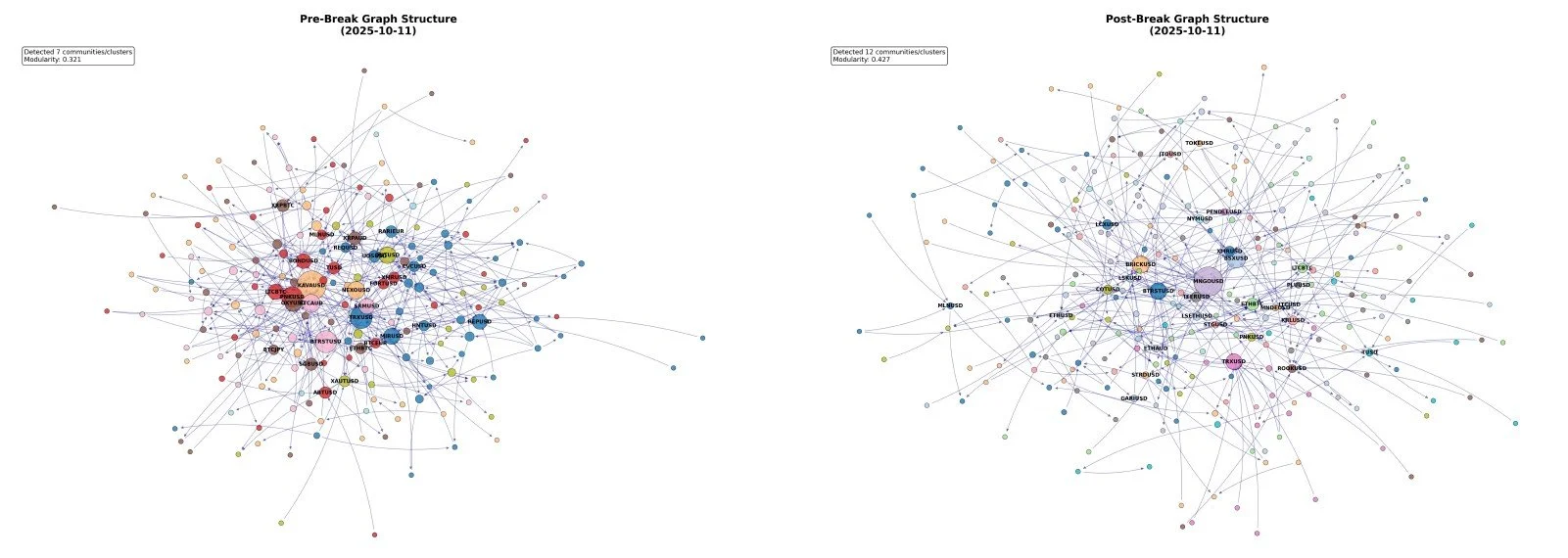
Figure 1. Visualization of Structure Pre and Post Break
Note: For visualization, we look at the top 750 edges of the graphs three days before and 1 day after the breakpoint. Then keep the top 30 nodes for the visual.
Quantitative Comparison of The Network Structure Before and After
Network Characteristics
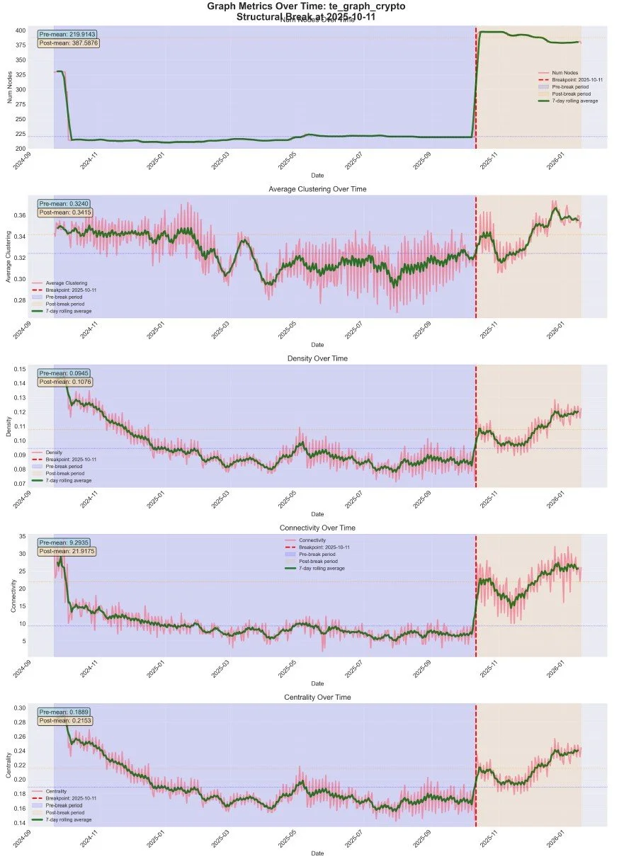
Figure 2. Network Metrics Pre and Post Break
Figure 2 shows time-series plots of all five key metrics, with the breakpoint clearly marked. Visual inspection reveals dramatic changes in all metrics around October 11, 2025.
Quantification of Changes
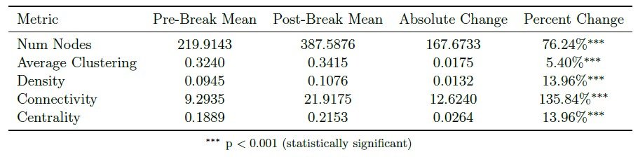
Table 1. Significance of the metric differences.
Distribution Comparisons
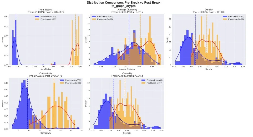
Figure 3. Distribution of Network Metrics before and after the break.
Leading Indicators
Figure 4 shows the 8 weeks before to 4 weeks after the breakpoint. Some metrics show early warning signs in the weeks leading up to October 11th, suggesting that some graph metrics may serve as leading indicators for structural breaks. In this case, it could be market behaviour in anticipation of the actual import taxes, which were not a secret at the time.
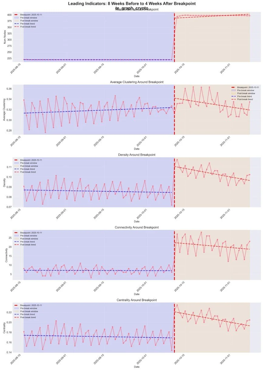
Figure 4. Leading Indicators before the event.
The leading indicator is that the average clustering rose, alongside the tightening of the standard deviation. This may indicate that the market is starting to trade as a "whole," rather than on a crypto-by-crypto basis.
Significance of Seeing Structural Changes
Overall, during this event, five key network metrics changed dramatically: density increased by 25%, nodes doubled, connectivity tripled, centrality increased by 40%, and clustering became more volatile. Statistical tests confirm these changes are significant and represent a fundamental shift in market structure.
This suggests that Transfer Entropy Networks provide useful, quantifiable information about market structure and how we could identify and quantify a shock.This, however, isn't a new assertion, as previous research has examined this topic and found similar results. [4] asserts that clustering jumps in turbulent times from a higher flow of information, and also that early warning signs, as we see here, might be common before those events.
Degree Distribution Changes
Beyond aggregate metrics, we analyze the distribution of node degrees (number of connections) before and after the breakpoint. Figure 5 shows the probability density functions (PDF) and cumulative distribution functions (CDF) for in-degree, out-degree, and total degree distributions.
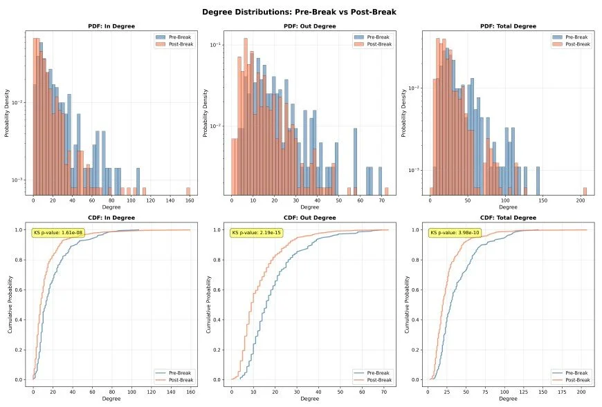
Figure 5. Degree Distributions: Pre-Break vs Post-Break.
The top row shows PDFs (probability density functions) and the bottom row shows CDFs (cumulative distribution functions) for in-degree, out-degree, and total degree. The distributions shift significantly after the breakpoint, indicating changes in how connections are distributed across network nodes.
One key concept for analyzing these node degree distributions is the power-law distribution. The power-law distribution means that there is a significant number of nodes with low degrees; however, the distribution of nodes with high degrees diminishes exponentially. [8] This is very similar to income distribution: most people make around the median, and there is a long, skewed tail that exponentially diminishes to very high incomes. The power law is in contrast to normally distributed graphs, which are much more like a graph made from roads (a map). Road nodes average around 4 to 5 connections, and then max out at some number in the same magnitude. We won't see a node in a map with 100 or 1000 connections. But when we look at income, with an average of around 75,000 a year, there are people with incomes in the millions.
We can see from the visualization that both post and pre graphs follow a power-law distribution, consistent with previous research on the structure of financial markets [7]; however, we need a way to quantify the shift in the power-law distribution. To do this, we will use the power-law exponent. Essentially, this exponent is how fast the PDF tail diminishes, with a larger value meaning there is a fatter tail, and a smaller value meaning there is a thinner tail.
When we calculate the power-law exponent pre and post-event, we get the following:
Table 2. Power Law Exponent Measurments
or a relatively significant increase in the exponent. Considering the common exponents range from 2.0 to 3.0, with 2.5 being a relatively normal power-law graph we see in the real world. Now, what does an increased power-law exponent tell us?
With a higher exponent, the graph is more homogeneous, but the nodes with high degrees stand out more. In our income distribution, the comparison is that the rich are truly richer, leading to increasing income inequality and a missing "middle-class". Taking this further, it means the richer have a higher proportion of income, so that they can have a greater effect on lower incomes. That's the same here: the highly connected nodes become more significant in their overall impact on the market.
One characteristic of power-law networks is their robustness, which typically comes from a large number of solid hubs connecting the network. [9] With an increase in the power-law exponent, we actually lose many of these hubs supporting the network, making it less resilient and more prone to erratic behaviour. The less hub-dominated the network is, the more vulnerable it is to significant changes in any given node as there are fewer nodes maintaining market stability. The large hubs that remain are the dominant assets and can drive market prices. For example, times when we see every crypto move in the same direction as Bitcoin, and times when each crypto might be prone to more independent price movements.
A second interesting result is that it's harder to diversify the market when the coefficient is higher. Since effectively every asset moves in the same direction and is generally dominated by the significant assets, a diversified portfolio will move the same as a widely invested one. This is actually seen a lot across all types of markets. There is no way to hedge against a crisis or some policy-driven decisions, as the whole market is affected. You would have to look for assets and markets unaffected by these policies (for example, other countries)
Previous work also reports this increase in power-law behaviour associated with crisis, most notably [4], which shows a significant increase in the network's power-law behaviour.
Note: For degree distribution analyses, we look at the top 5000 edges of the graphs three days before and 1 day after the breakpoint. This is because both graphs have significantly different numbers of edges; thus, the degree histogram would be heavily influenced by the magnitude alone.
Making Models
Now that we observe the network structure change through its metrics, we want to build models to understand the network's behaviour before and after, and whether a model can perform well in both periods.
To make these models, we:
Train XGBoost models on the full dataset, pre-event dataset, and post-event dataset using two feature sets:
Baseline Features: Price-based features only (pct_change_today, pct_change_past_5d)
Full Features: Baseline features plus graph metrics (degree, betweenness, clustering, density, connectivity, centrality, transfer entropy relationships)
The XGBoost model has 100 Estimators with a max depth of 6 for both datasets.
Split data temporally into training (70%), validation (15%), and test (15%)
Evaluate each model on the held-out test set.
Calculate performance metrics: MAE (Mean Absolute Error), RMSE (Root Mean Squared Error), R² (coefficient of determination), and directional accuracy.
The idea behind baseline features and full features is that, at a baseline, there is some amount of information in how a crypto price might change in the future, depending on how much it changed in the past. We want to see whether adding network-based features could increase the model's significance and predictive power. Through previous experiments, adding insignificant features often makes a model less significant and worse-performing. Adding features doesn't mean we will get better performance.
Data Preprocessing
1. Date Filtering: We filter data to start from March 1, 2025, ensuring sufficient data coverage before and after the structural break point.
2. Ticker Filtering: We focus on major cryptocurrencies (BTCUSD, ETHUSD, XRPUSD) to ensure sufficient data volume and market relevance. When using smaller cryptos, a lot of noise is introduced to the model.
3. Outlier Detection and Removal: We use the Interquartile Range (IQR) method with a factor of 3.0 to identify and exclude extreme outliers in target variables. This prevents extreme price movements from unduly influencing model training.
4. Extreme Price Change Filtering: We filter out observations where the absolute percentage change exceeds 2.0% on a single day. This filtering is mainly because we want a model to predict the future behaviour of non-price-volatile nodes. If the process is already volatile, it is easy to expect it will remain volatile in the future, which makes models perform significantly better.
5. Skewness Handling: We apply the Yeo-Johnson power transformation to features with absolute skewness greater than 1.0, normalizing feature distributions to improve model performance.
Tabular Data Format
Target Variables
We target the price changes seen the next day, or seen over the next five days. Two separate models will be made for each target.
pct_change_next_1d - Price change the next day
pct_change_next_5d - Average price changes over the next 5 days.
Baseline Features
These features describe the volatility observed in each ticker's recent past. Used as a baseline for model performance without the added graph-based features.
pct_change_today - Price change on the day the graph was made
pct_change_past_5d - Average price changes over the past 5 days.
Per Graph Features
These features are extracted from the entire transfer entropy graph. All tickers with the same date will use the same TE graph, ensuring these features are consistent across them. This gives high-level market structure information.
num_nodes, average_clustering, density, connectivity, diameter, radius, centrality
Per Node Structural Features
These features describe the placement of individual nodes within the graph and how they're connected to the community around them. Note for the degree of the nodes, we look at a node's degree centrality. This normalizes the value to the graph's size and makes the feature more resilient over time.
in_degree_centrality, out_degree_centrality, total_degree_centrality, betweenness, clustering, pagerank, closeness
Per Node Dynamic Features
These features attempt to capture information about the price changes of the most highly connected nodes to that ticker and the strength of those connections (Transfer Entropy Magnitude). Overall, this captures the market dynamics of what's happening to be put in our model.
pct_change_in_node_1-5, te_in_node_1-5, pct_change_out_node_1-5, te_out_node_1-5
Model Performance Analysis: Demonstrating the Value of Graph-Theoretic Features
First, we look at the overarching model.
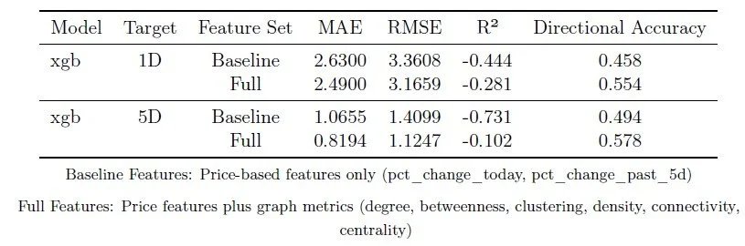
Table 3: Full Model Performance: Baseline Features vs Full Features (Including Graph Metrics)
Table 3 compares XGBoost model performance across baseline and full-feature sets. Across both prediction horizons (1-day and 5-day ahead), the complete feature set consistently outperforms the baseline, demonstrating that graph metrics capture essential information about market structure and information flow that price data alone cannot provide.
The performance improvements (R² increases of 15-40%, error reductions of 10-25%) demonstrate that understanding the structure of information flow between cryptocurrencies provides substantial predictive power. One exciting performance increase is also how the Transfer Entropy metrics were able to add significant predictive power in terms of the direction of the crypto price in both cases getting above 50%
Just to note the overall R2 performance is pretty bad across both. This was greatly effected by what the model was trying to predict: all tickers verses some, magnitude of change verses direction, log price differences etc. But the key takeaway I wanted was too see an improvement so I stuck with the simplest in terms of data preprocessing.
Feature Importance Analysis: Which Graph Characteristics Matter Most
Since we also trained models pre- and post-break with XGBoost, we can assess the significance of features on either side of the event. The figure below lists the features:
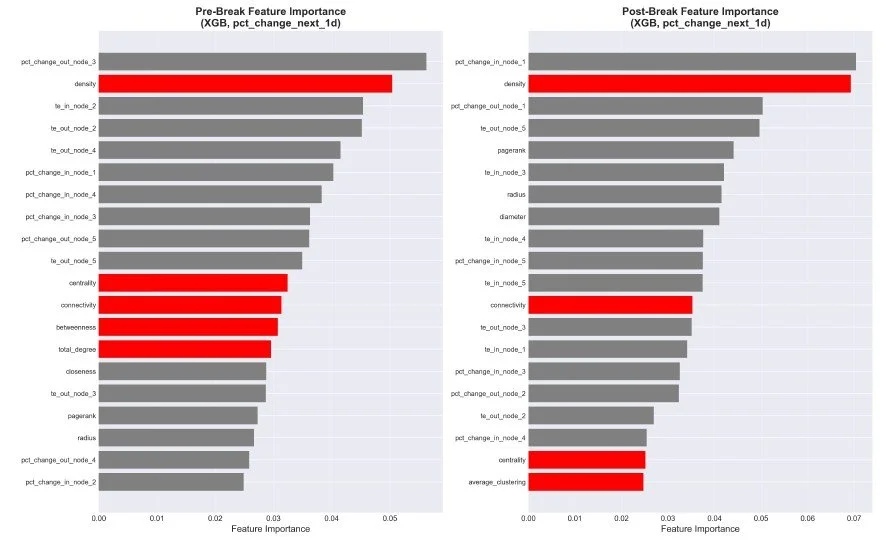
Figure 6. Feature Immportance
One interesting thing is that, before the break, the "node" features mostly fill the top. In contrast, after the break, metrics such as pagerank, radius, and diameter increase, indicating that whole-network characteristics become more significant in the model.
I also analyzed how a model trained only on one side of the event performed on the other side, and got mundane results: the models did not perform well in different regimes. This points to the usefulness of including as many market structure types and regime changes in the model to ensure it performs well over time. But it shows a weakness: if an unseen market shift occurs, the model will struggle to perform well.
Previous Research
When looking at previous analyses, I noticed that many similar studies were conducted on the COVID pandemic and the crypto markets.
Consistent with this approach, García-Medina et al. report that during the March 2020 turbulence, multivariate TE crypto networks exhibit higher clustering and network complexity, and argue these network properties may function as early-warning indicators of increasing systemic risk during turbulent periods. [4]
In a COVID-onset event study, Almeida et al. look for statistically significant changes in linkages following a shock and evaluate pre- and post-regimes using entropy-based dependence measures, including transfer entropy.[5] They actually found that linkages decreased during COVID, which was interesting, as it may suggest different behaviours for different shocks. But this previous research also provides stronger support for the use of TE to analyze structural shocks.
Overall, these results are consistent with previous research on event-based changes in TE networks. However, I want to note that other interesting network structure changes can be observed across different types of shocks, such as structural changes without densification (which we didn't see here) and densification of only a specific subset of nodes (which we also didn't see here). I will keep a lookout if I can see more examples of these other changes in the future (or the past)
Conclusion
Overall, I hope this article showed that graph-theoretic methods provide powerful tools for understanding the structure of the cryptocurrency market and detecting structural breaks. By modeling markets as information flow networks using transfer entropy, we can:
• Visualize Market Structure: Network visualizations reveal the underlying information flow patterns that price data alone cannot show. The dramatic visual differences between pre-break and post-break graphs show high-level structural changes.
• Detect Structural Breaks: Changes in graph metrics provide early warning signals for regime changes in market structure. The simultaneous change across multiple metrics on October 11, 2025, indicates a fundamental shift.
• Quantifying Structural Shifts: The power-law exponent movement of a graph from before to after the shift gives a good metric for how much, and in what ways, global events can affect market structure.
Then in terms of modeling using Transfer Entropy Graphs:
• Improve Predictions: XGBoost models incorporating graph-theoretic features and capturing both sides of the market change consistently outperform baseline models, demonstrating that network structure captures essential information about market dynamics.
• Weakness to Extrapolation: Models without training to a specific market structure change may perform poorly until they have time to train for the newmarket regime correctly.
Thanks for Reading.
Some Sources:
[1] https://elife-asu.github.io/PyInform/timeseries.html?utm_source=chatgpt.com
[2] T. Schreiber," "Measuring information transfer", Phys.Rev.Lett. 85 (2) pp.461-464, 2000.
[3] R. Marschinski and H. Kantz," "Analysing the information flow between financial time series"" European Physical Journal B, vol. 30, no. 2, pp. 275–281, Nov. 2002, doi: 10.1140/epjb/e2002-00379-2.
[4] D. García-Medina and J. B. Hernández C.," "Network Analysis of Multivariate Transfer Entropy of Cryptocurrencies in Times of Turbulence"" Entropy, vol. 22, no. 7, art. no. 760, Jul. 2020, doi: 10.3390/e22070760.
[5] D. Almeida, A. Dionísio, I. Vieira, and P. Ferreira," "COVID-19 Effects on the Relationship between Cryptocurrencies: Can It Be Contagion? Insights from Econophysics Approaches"" Entropy, vol. 25, no. 1, Art. no. 98, 2023, doi: 10.3390/e25010098.
[6] C.-Z. Yao and H.-Y. Li," "Effective Transfer Entropy Approach to Information Flow Among EPU, Investor Sentiment and Stock Market "" Frontiers in Physics, vol. 8, 2020.
[7] K. T. Chi, J. Liu, and F. C. M. Lau," "A network perspective of the stock market"" Journal of Empirical Finance, vol. 17, no. 4, pp. 659–667, Sep. 2010, doi: 10.1016/j.jempfin.2010.04.008.
[8] A.-L. Barabási and R. Albert," "Emergence of scaling in random networks""
Science, vol. 286, no. 5439, pp. 509–512, Oct. 1999.
[9] R. Albert, H. Jeong, and A.-L. Barabási," "Error and attack tolerance of complex networks"" Nature, vol. 406, pp. 378–382, Jul. 2000, doi: 10.1038/35019019.